
A fashion journey from initial acquaintance to mutual benefit
For streetwear brands, Custom brand color selection changes how people view your brand. You must pick colors that match your brand identity. Your color choices should also fit your audience and branding goals. Studies say about 85% of buyers pick products because of color. Up to 80% think color helps them remember brands. Color affects first impressions a lot. Almost 90% of what people notice comes from brand colors. Good color choices help people remember your brand. They also help people feel connected to your brand. Bad color choices can hurt your brand identity. They can also confuse your audience. Branding works best when you choose colors that fit your brand and help you stand out.
Pick brand colors that fit your brand’s style and beliefs. This helps people know your brand. Know what your audience likes. Think about their age, gender, and culture before you choose colors. Look at your competitors’ colors. See what works for them. Use colors that help your brand stand out. Make a color palette with one main color. Add other colors that look good with it. Use the same brand colors everywhere. This helps people trust and remember your brand. Try your colors on screens, in print, and in different lights. Please make sure they always look good. Ask your team and customers what they think. Use their ideas to pick better colors. Do not use too many colors. Always test your colors. This keeps your brand simple and professional.
Your brand identity is how people see your business. When you pick colors, you show your brand’s personality and values. Each color you choose becomes part of your brand’s story. You want people to feel something when they see your logo or products. The colors you use help create that feeling.
Brand traits tell what your business stands for. These traits come from your mission and vision. If you want your brand to feel energetic, use bold colors like red or orange. If you want to show trust, blue or green can help. Many famous brands use color to show their traits. Coca-Cola uses red for energy. Tiffany & Co. uses blue for luxury. McDonald’s uses red and yellow for a friendly feeling. UPS uses brown for reliability. Facebook uses blue for trust. Starbucks uses green for nature and quality. These brands use their colors everywhere so people know them.
Your mission and vision help you pick colors. If your mission is to bring joy, yellow can show happiness. If your vision is to lead in technology, blue can show trust. Playful brands use bright colors. Serious brands use muted tones. Nike uses black for strength and style. Apple uses gray and white for a clean look. Barbie uses pink for playfulness. When your colors match your mission and vision, people understand your brand values.
Color psychology shows how colors affect feelings and choices. People react to colors in different ways, but some reactions are common. Warm colors like red and orange create excitement. Cool colors like blue and green make people feel calm. Using color psychology helps shape how people think about your brand.
Colors make people feel certain emotions. Red grabs attention and makes people feel alert. Blue builds trust and makes your brand seem reliable. Green connects to health and growth. Yellow brings out happiness and creativity. Brands use these feelings to connect with people. Coca-Cola’s red makes people think of celebration. IBM’s blue shows expertise. Starbucks’ green logo suggests freshness. When you use colors on purpose, people remember and trust your brand.
Tip: Always use the same colors in all your branding. This helps people know your brand and makes your identity stronger.
It is important to know your audience when picking brand colors. The colors you pick should match your brand’s style. They should also connect with the people you want to reach. Different groups like different colors. You need to know your audience before you choose your colors.
Demographics affect how people see color. Age and gender matter a lot for color choices. Studies show men and women like different colors. Both like blue, but women often like softer colors. These can be pink or pastel colors. Men usually pick brighter colors like ruby red. Purple is liked more by women than men. Gender can also change how people see color. More men are colorblind, so they may see colors differently.
Age changes what colors people like. Kids and teens like bright colors like yellow, orange, and red. These colors stand out and feel fun. As people get older, they like different colors. Young adults may like soft or neutral colors. Older adults and seniors pick classic or muted colors. These can be navy, gray, or pastel pink. You can see these choices in many brands. Toy brands use bright colors for kids. Luxury brands use soft colors for older people.
Culture also changes what colors mean. In Western places, white means purity and weddings. In some Eastern places, white means sadness. Red means love in the West but luck in Asia. Blue is seen as a boy color in the West but a girl color in China. These differences show why you must know your audience’s background. Picking the wrong color can send the wrong message and hurt your brand.
Tip: Always check your audience’s culture and age before picking your brand colors. This helps you avoid mistakes and connect with your audience.
Demographic Factor | Color Preference Details |
|---|---|
Gender | Women like light or pastel colors. Men like bright or bold colors. More men are colorblind. |
Age Groups | Kids: yellow, orange; Teens: red, blue; Young Adults: pastel, neutral; Adults: classic, muted; Seniors: soft, light colors. |
Culture | White: purity (West), sadness (East); Red: love (West), luck (Asia); Blue: boy (West), girl (China). |
Not everyone sees color the same way. Women know more color names and see more shades. This is true for green and blue colors. Men use simple color names and look at how light or dark a color is. These differences come from both biology and culture. Hobbies and jobs can also change how people see and name colors.
Using color psychology helps match your brand to your audience. Pastel colors are good for young people who want a fun look. Bold colors work for older people who like strong and classic styles. Test your colors with your audience to see what works. This makes sure your brand colors fit your brand and connect with your audience.
You should examine the colors used by your competitors. This will help you understand which colors are effective in your field and also showcase the brand's uniqueness. Many major brands use specific colors to convey messages.
Clothing is something closely related to people's lives. Usually, people tend to use clothing to express their personalities and interests, which makes them pay attention to the brand's colors first when choosing clothing.
Some brands do not follow the usual color rules. No Name, a Canadian brand, uses yellow and black. This makes the brand easy to see and remember. Airbnb changed its colors to pink-red. This shows warmth and welcome. These choices help brands stand out from others.
Tip: Look at your competitors’ color schemes, but try to make yours special.
Be aware of new color trends. Each year, experts pick colors that match how people feel. For 2025, some trends are burning red, neutral tones, and bright sunny colors. Ethereal tones and sea-to-sky colors are also popular. These trends help brands show energy or calm.
Pantone’s Color of the Year, like Viva Magenta, leads color trends. Brands use these colors in logos and packaging to look modern. Fashion weeks and home décor trends also change what colors feel new.
You do not have to change all your colors. You can add a trendy color as an accent. This keeps your main colors strong and lets you try new ideas. Test your new colors to make sure they look good and are easy to read. You can use AI tools to help pick colors for your brand. Always think about how colors make people feel and what they mean in different places.
Try using trends in small ways, like for a special campaign.
Mix parts of different color schemes to create something new.
Look at nature or design websites for inspiration.
Note: Do not follow every trend. Pick what fits your brand and helps you connect with your audience.
Choosing the right colors for your brand shapes how people see your business. Custom brand color selection helps you build a strong visual identity and makes your branding stand out. You need to use color theory, test your choices, and keep everything consistent. This section will guide you through building a color palette, picking your main and supporting colors, and making sure your brand looks the same everywhere.
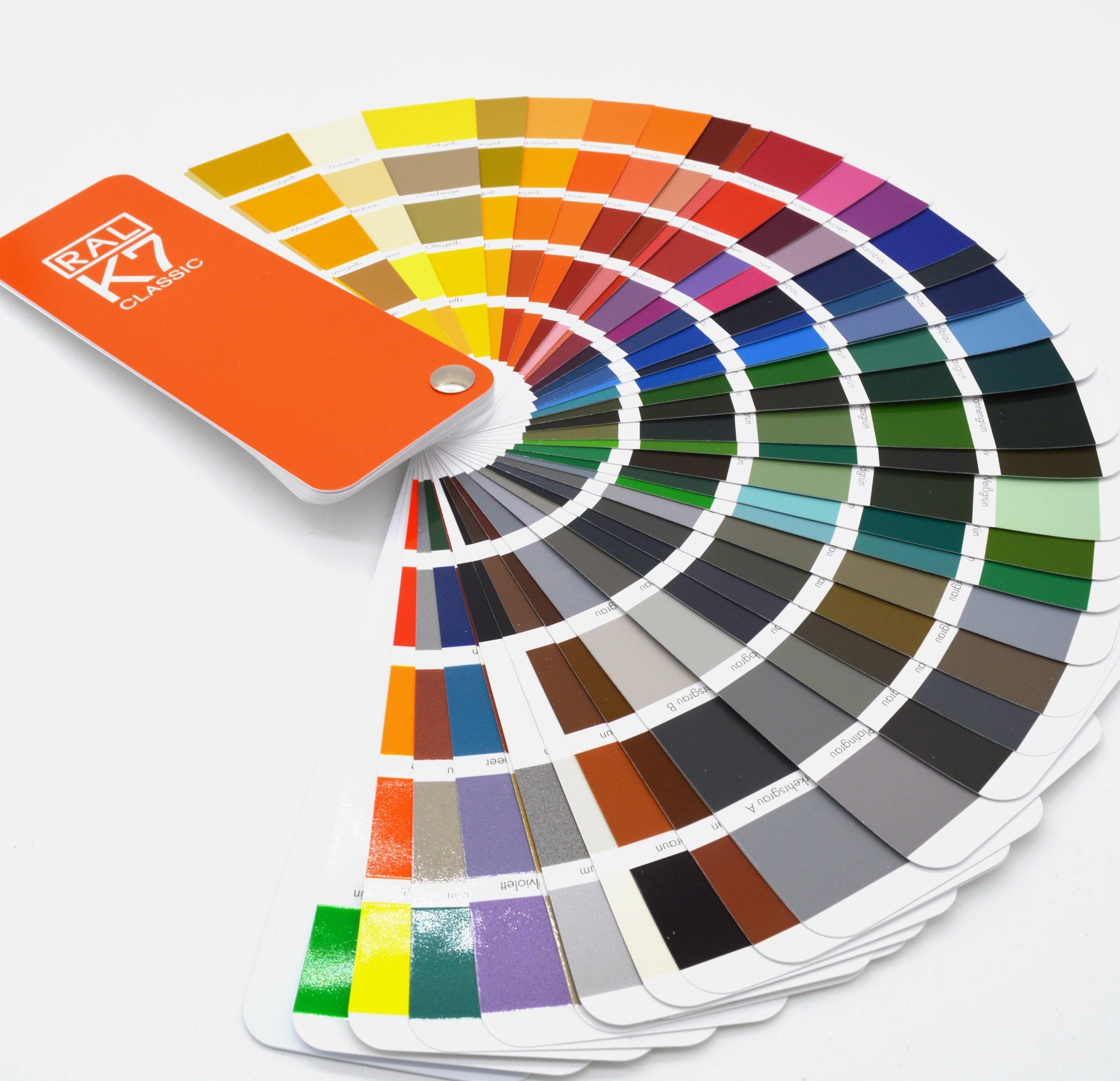
A color palette is a group of colors you use for your brand. It sets the tone for your branding and helps people remember your business. You want your palette to look good and feel right for your brand. Color selection starts with understanding color theory. The HSB model—Hue, Saturation, and Brightness—helps you pick colors that work well together. You can use the color wheel to see how colors relate. For example, complementary colors sit across from each other on the wheel and create strong contrast. Analogous colors sit next to each other and feel calm. You can also use triadic or split-complementary schemes for balance.
Tip: Start with one main color and build your palette around it. Use color psychology to pick colors that match your brand’s message.
Your primary color is the main color people will connect with your brand. This color should show your brand’s personality and values. Think about what you want people to feel when they see your branding. For example, blue can show trust, while red can show excitement. When you choose your primary color, look at your brand’s mission and the emotions you want to create. Make sure your color works well in different places, like your website, packaging, and social media.
To select your primary color, follow these steps:
Learn about your audience. Use surveys or data to see what colors they like.
Define your brand’s values. Decide what message you want your color to send.
Check how colors mean different things in different cultures.
Look at your competitors. Decide if you want to fit in or stand out.
Pick a hue, then adjust the saturation and brightness to match your brand’s style.
Test your color on different materials and screens.
Ask for feedback from your team or customers before you decide.
A strong primary color helps people remember your brand. It also makes your branding look professional and trustworthy.
Supporting colors help your primary color stand out. They add depth and variety to your color palette. You should pick these colors using color harmonies. For example:
Use complementary colors for strong contrast.
Try analogous colors for a calm, natural look.
Use triadic colors for balance and energy.
Split-complementary schemes give you contrast without being too harsh.
When you pick supporting colors, think about how they make people feel. Make sure your palette fits your brand’s values. Test your colors in different places, like websites and print. Limit your accent colors to two or three. Too many colors can make your branding look messy. Always check that your colors have enough contrast. This helps everyone, including people with vision problems, see your brand clearly.
Note: Supporting colors should not take attention away from your primary color. They should work together to create a balanced look.
Visual consistency means using your brand colors the same way everywhere. This helps people recognize your brand and trust it. When you use the same color palette on your website, social media, and products, you build a strong visual identity. Consistent branding makes your business look professional.
Follow these steps to keep your branding consistent:
Create clear brand guidelines. Write down your color codes, logo rules, and fonts.
Make templates for things you use often, like social media posts or slides.
Store your brand assets in one place so everyone can find them.
Teach your team about your brand rules. Hold training sessions if needed.
Check your materials often to make sure they follow your guidelines.
Consistent use of brand colors builds trust and helps people remember your brand. Studies show that people remember a brand’s color more than its name. When you keep your color scheme the same, you create a strong bond with your audience. If you change your colors too much, people may get confused and lose trust in your brand.
Callout: Consistency in color selection is key to strong branding. It helps your brand stand out and makes it easier for people to remember you.
You need to see how your color selection works in real life. Colors can look different on screens and in print. You should always test your colors in both digital and print formats. Start by checking your colors on different devices like phones, tablets, and computers. Each screen can show colors in a unique way. Next, print your color palette on different types of paper. Glossy and matte paper can change how your colors appear.
Follow these steps to make sure your colors stay true:
1. Learn about color gamuts. Printers and screens have limits on which colors they can show. Check printer specs to know what is possible. 2. Use the right color spaces. RGB works best for screens. CMYK is for print. Pantone colors help keep things the same everywhere. 3. Make a brand style guide. Write down your color codes and Pantone numbers. This helps everyone use the same colors. 4. Add color profiles to your digital files. This helps printers match your colors. 5. Calibrate your screens and printers often. Devices can change over time. 6. Print test samples before making lots of copies. This lets you fix problems early. 7. Work with printing experts if you need help. They know how to solve tricky color issues.
Tip: Always test your color selection in the places your audience will see it. This helps you avoid surprises and keeps your brand looking sharp.
After you test your colors, you need to gather feedback. Ask people what they think about your color palette. You can use surveys, interviews, or focus groups with your target audience. This helps you learn if your colors match your brand’s message.
Try these ways to collect feedback:
Share your color choices with your team. They can give you new ideas.
Ask customers what they think. Their opinions matter most.
Show your colors to branding experts or designers. They can spot problems you might miss.
Use A/B testing. Show two versions of your design with different colors. See which one people like more.
Keep your process flexible. If people do not like a color, change it. If your brand grows or changes, update your palette. Always check that your color selection fits your brand and connects with your audience.
Note: Good feedback helps you build a strong visual identity. Do not be afraid to adjust your colors until they feel just right.
You need to document your brand colors and branding rules so everyone can use them the right way. Good documentation helps your team, designers, and partners keep your brand looking the same everywhere. Start by making a clear set of brand guidelines. These guidelines should include your color palette with swatches and exact color codes for digital and print use, such as HEX, RGB, and CMYK.
Here is a simple way to organize your brand color documentation:
List your main and supporting colors with swatches.
Add color codes for each color in HEX, RGB, and CMYK formats.
Show examples of how to use your brand colors in logos, backgrounds, and text.
Write clear instructions for when and where to use each color.
Include do’s and don’ts for color use to avoid mistakes.
Make your guidelines easy to find by sharing them as PDFs or on an online portal.
Update your documentation when you change your brand colors or branding style.
Teach your team about the guidelines with training sessions or workshops.
Offer support, like a help desk or brand ambassador, to answer questions.
Tip: Keep your guidelines simple and easy to read. Use pictures and examples to help everyone understand.
When you document your brand colors well, you help everyone use them the right way. This keeps your branding strong and clear.
After you finish your documentation, you need to put your brand colors into action. Start by updating all your branding materials. This includes your website, social media, business cards, packaging, and ads. Use your brand guidelines to make sure every item uses the right colors.
Follow these steps to roll out your new brand colors:
Apply your colors to all digital and print materials. Use the correct color codes for each platform.
Test your colors on different screens and paper types to check for consistency.
Use the 60-30-10 rule: 60% neutral colors, 30% secondary colors, and 10% main brand color for accents.
Give your team access to your brand guidelines and color codes.
Run training sessions to show everyone how to use the new branding.
Collect feedback from your team and customers. Make small changes if needed.
Use tools like brand kits to save your colors and make them easy to use in design programs.
Note: Consistent use of your brand colors builds trust and helps people remember your brand.
When you follow these steps, your branding will look professional and unified. You will make your brand easy to recognize everywhere people see it.
You must think about your audience when picking brand colors. If you ignore what your audience likes, your brand can suffer. Many brands make mistakes when they forget about what people want:
Not following industry rules can make your brand look strange. For example, green is for eco-friendly brands. Blue is common for tech companies.
If you do not match your brand identity, your colors will feel wrong. Airbnb uses warm colors to look friendly and welcoming.
If you forget how colors make people feel, your message gets weaker. Colors help people feel certain ways about your brand.
Not thinking about culture can send the wrong message. White means purity in the West. In some Asian places, it means mourning.
If you skip neutral colors, your palette can get too bright. Neutrals help balance your design and make it easier to read.
Using colors with low contrast makes things hard to read. This is tough for people with vision problems.
Tip: Test your color choices with your audience. This helps you avoid mistakes and connect better.
You should know about color trends in your field. If you miss trends, your brand might look old or out of touch. Brands that use trends build trust and stand out. For example, fintech brands use blue for trust. Green works for health and nature. Red grabs attention in food and entertainment.
Color | Common Use and Meaning |
|---|---|
Blue | Trust, stability (tech, finance) |
Green | Health, growth (eco, wellness) |
Red | Energy, excitement (food, sports) |
Yellow | Optimism, caution (retail, safety) |
Purple | Luxury, power (beauty, luxury) |
Black | Elegance, authority (fashion, auto) |
Look at what top brands in your area use. Test your colors to see if they fit your brand and audience. This keeps your brand looking new and connected.
Note: Trends change often. You do not have to follow every trend. Pick what fits your brand and helps you connect.
If you use too many colors, your brand can get confusing. Too many colors make your design hard to remember. People may not know what your main message is. A simple palette helps people spot your brand fast.
Designers say to use three main colors. Pick a primary color, a darker shade, and a contrasting color. This keeps your brand clear and easy to see. Brands like Coca-Cola and McDonald’s use simple palettes. Their colors make them easy to remember.
Too many colors can make your brand look messy. People might feel overwhelmed or annoyed. This can push your audience away. Keep your palette simple for a strong impression.
Callout: Using fewer colors makes your brand easier to remember. It also helps people trust your brand.
Many people skip testing their brand colors. This mistake can hurt your brand. You might think your colors look great on your computer. In real life, colors can change. They can look different on phones, tablets, or printed materials. If you do not test, you risk confusing your audience.
Testing helps you see how your colors work in the real world. You want your brand to look the same everywhere. If your colors look different on each platform, people may not trust your brand. They may even forget your brand. Testing stops these problems before they start.
Why Testing Matters:
Colors can shift on different screens. A blue on your laptop may look purple on a phone.
Printers use different inks. Your bright red may turn dull on paper.
Lighting changes color. A color that looks good in daylight may look strange indoors.
People with color blindness may not see your colors as you do.
Tip: Always test your colors on many devices and in different lighting. Print samples to check how your colors look on paper.
What Happens If You Skip Testing?
Your logo may blend into backgrounds.
Text may become hard to read.
Your brand may look unprofessional.
Customers may not recognize your brand.
You may lose trust and sales.
Here is a simple checklist to help you test your brand colors:
View your colors on different screens (phone, tablet, computer).
Print your colors on different types of paper.
Check your colors in bright and dim light.
Ask people with color blindness to review your designs.
Get feedback from your team and customers.
Use online tools to check color contrast and accessibility.
Testing Step | Why It Matters |
|---|---|
Screen Testing | Colors change on different devices |
Print Testing | Inks and paper affect color quality |
Lighting Check | Colors shift in various environments |
Accessibility Review | Ensures everyone can see your brand |
Feedback Collection | Finds problems you may not notice |
Callout: Testing your brand colors saves time and money. You fix problems early. Your brand looks strong and clear everywhere.
Never skip testing. You want your brand to shine in every place people see it. Testing helps you build trust and makes your brand easy to remember. Take time to test, and your brand will stand out.
You can build a strong brand if you follow simple steps. First, decide what your brand’s personality and goals are. Look at color trends to see what is popular. Use tools like Adobe Color or Coolors to pick your colors. Test your colors on real things, not just screens. Ask your audience what they think about your colors. Change your style guide to keep your look the same everywhere. Try using a brand identity worksheet or an audience survey to help you get started.
Start by listing your brand’s values and goals. Look at color meanings and see which ones match your message. Try free online tools like Adobe Color to explore palettes.
Most brands use three to five colors. Pick one main color, one or two supporting colors, and a neutral. This keeps your look simple and easy to remember.
Yes, you can update your colors as your brand grows. Test new colors with your audience first. Update all your materials and guidelines to keep your branding consistent.
Yes. People connect certain colors with trust, safety, or excitement. For example, blue often builds trust. Using the right colors helps people feel good about your brand.
Test your colors on screens and in print. Use color codes like HEX for digital and CMYK for print. Calibrate your devices and ask others to review your designs.
You can use tools like Coolors, Adobe Color, or Canva’s color palette generator. These tools let you try different combinations and see how they look together.
Trends can help your brand look modern. Only use trends that fit your brand’s style and message. Do not change your main colors too often.
Use online tools to check color contrast. Make sure text stands out from backgrounds. Ask people with color blindness to review your designs. Accessible colors help everyone see your brand.


 contact@aqii.group
 +86 13777583786
